The Spot – New Restaurant WordPress Theme
Today I released The Spot, my next restaurant WordPress theme with a focus on high-impact photos and bold typography. Jump straight to the demo.
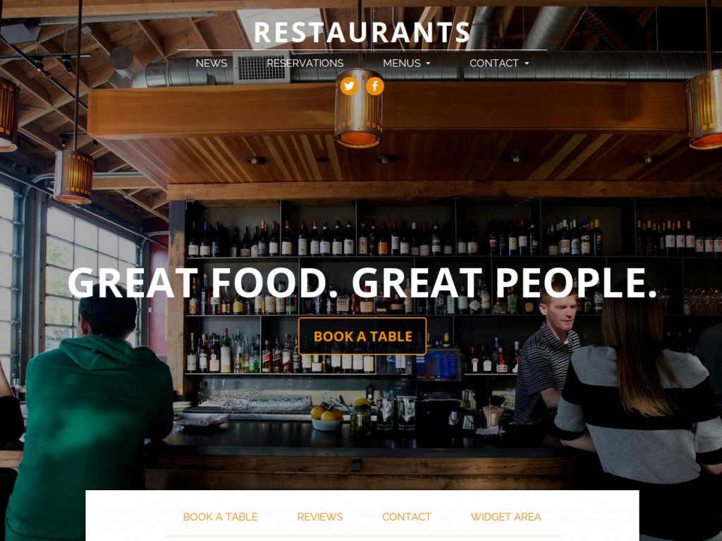
When I began working on The Spot I wanted to build a theme for restaurants, bars and venues that don’t need a lot of content. Most restaurants don’t need a massive front page, tons of different pages or half a dozen layouts. They just need exceptional photography paired with quick access to a key info.
Great big beautiful photography
Nothing connects an eatery to its best patrons better than an image. So I decided to clear out room on the front page for a big, beautiful photograph. I laid a strong, clear call to action on top, so customers who are inspired can quickly connect to your most important piece of information — maybe that’s an online reservations form, maybe it’s a contact page with a phone number, maybe it’s your menu. Whatever that is, you can customize your front-page to really engage people and channel their attention.
Bold, confident fonts, colors and typography
The Spot features a confident vibe with strong color contrast and big, bold type. The accent color — a bright orange in the demo — can easily be changed through the WordPress customizer.
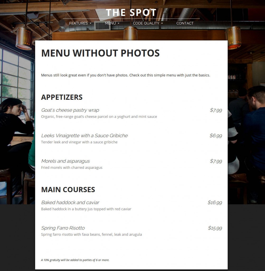
Since most restaurants don’t have a lot of text, I chose to feature large type that really stands out even when there isn’t a lot of content. The interplay between the bold, upper-case Open Sans font and the italicized, elegant Raleway font really lets your text shine even when there isn’t much else going on. Here’s what a menu looks like without any text and the sidebar option turned off.
Flexible slide-up content deck
Hugging the bottom of the user’s screen on the front page is a small content deck that slides into focus when clicked. This is great for storing all those little pieces of content that don’t need their own page, but are arguably more important to a restaurant than a regular page or post. Show off a great review, give them quick access to all your contact details or get them to book a table from any page on your site. Want something else I haven’t supported? No problem. You can also slot a widget area into any one of the panels to display content from any third-party plugin.
Mobile-first
I have continued the practice I started with Plate Up by focusing on a mobile-first design strategy. This ensures the site looks and works great on mobile phones, loads quickly even on slower connections and is easy to navigate on touch devices. In the restaurant industry, mobile is no longer a second class citizen. Mobile visitors now represent nearly 50% of visits to many restaurant websites.
Sounds like a dream come true? I thought so. Go check out The Spot.

