How to build a good navigation menu for restaurants
A website navigation menu may seem like a simple thing. But like most things on the web, what seems simple may not be so.
In this post, I’ll cover a few of the things you should consider when designing your restaurant’s primary navigation menu.
What’s a primary navigation menu?
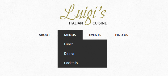
When I talk about a primary navigation menu, I’m referring to the main list of links that users will use to browse around your site. Often you’ll see them with dropdown menus, like this one from my Luigi theme.

Keep it brief
Most restaurants won’t have a lot of content on their site. You’re not the New York Times or Buzzfeed.
You’ve got a homepage, your restaurant menu, maybe a page where they can book a table, perhaps some information about your history or ongoing events, and a contact page to find you, phone you and map your location.
You may be able to get away with a four- or five-link navigation menu:
- Home
- Menu
- Reservations
- Find Us
- Events (maybe)
When working with a restaurant client, often the first inclination will be to add more. Resist this temptation.
The more items you add to the navigation menu, the longer it will take a visitor to find what they want. If there are a few high-value pages you really want the visitor to look at, like where they book a table, then make sure you present a short list so their eye can take in all the options at a glance.
That won’t work for everyone, though. If you have a new menu item that’s really valuable — like a page with great reviews of your cafe or a blog written by your sommelier — then go ahead and add it.
Managing larger navigation menus
Even if you followed my advice to keep it brief, you may still find you have more than 6 or 7 links in your navigation menu.
Maybe you’ve got a large menu that’s broken up into 3 or 4 pages. Maybe your restaurant has some famous history to it and you need an extra page or two to describe some of those details.
Once you reach that point, you’ll need to start nesting menu items. Here’s an example of how you might split a large food and drink menu into multiple menu items on your site:

If you didn’t know you could nest menu items in WordPress, this video will show you how.
When you’re nesting menus, it’s usually best to make sure that the link at the top goes to an actual page. So in my screenshot above, Menus should be a page, even if all it does is present links to the other menus on the site.
You should also make sure that you’re only nesting one level. In WordPress, it’s possible to create many nested tiers of menu links. This can quickly become unwieldy and difficult to manage for some users. Here’s an example from a user test:
Keep it brief (again)
Great, you’ve sorted out how many items are going to be on your menu and how you’re going to nest them. Now you need to decide how to label them.
For most navigation links on most restaurants, this will be pretty easy: Menu, Reservations, About, Contact, Events. There’s no shame in being boring here. The goal is to make it as easy as possible for your visitor to find the content they want, and they’ll recognize those words immediately.
Your navigation menu will usually occupy a valuable piece of real estate on your site, too, so you don’t want to fill it up with long phrases. The visitor will be scanning rapidly when they hit it and may skip over anything that can’t be understood at a glance.
Don’t say “Make a Reservation with Us” when you can say “Reservations”. If you’ve got lots of menus that are nested, just stick with “Menus” for the top-level item. Don’t complicate things with “All of our menus”.
Things get more difficult when your restaurant has multiple locations and you want to list them in a nested menu. Shy away from overly detailed location names, like “132 W Boulevard St”. Stick with more widely understood labels, like “Uptown”, “Downtown” or the name of the neighborhood.
That will be more likely to be recognized by your visitor and, by keeping it brief, you’ll make it easy for them to pick it out of a longer list.
Nailing your navigation menu
Getting your restaurant’s navigation menu right can be tricky. It requires a combination of skills: pragmatic organization, good word choices, and an eye for how the menu sits on the page visually.
If you’re unsure, err on the side of caution. Reduce the number of items, or nest them when you have a large number. And use short, descriptive labels whenever possible.
Finally, don’t be afraid to make changes if you get any negative feedback. It’s not easy finding the right mix for your customers. If someone says they struggled to find something on your site, think about how you can make it easier.
If you do that, you’ll get to a great navigation menu for your restaurant in no time.


