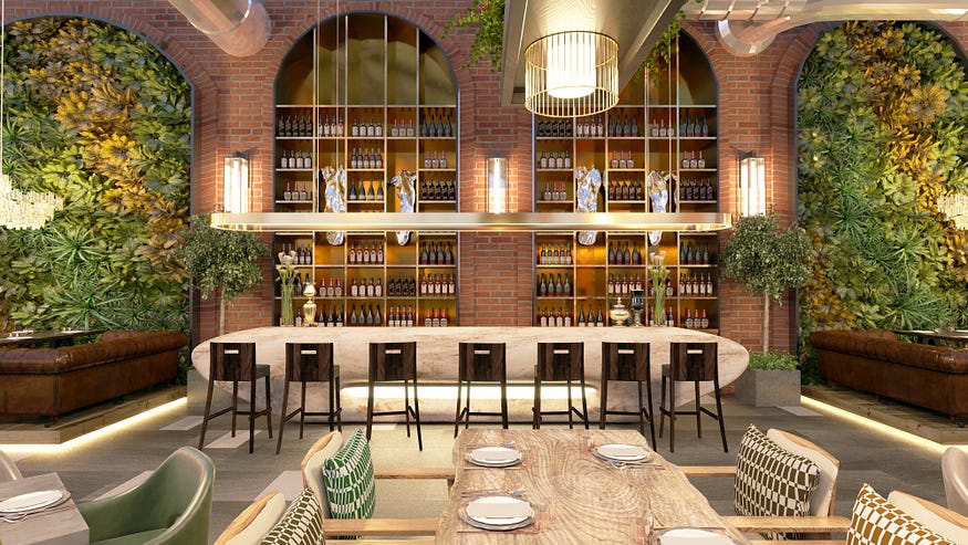
Making a great restaurant website homepage
In the ever-evolving landscape of the culinary world, a restaurant’s online presence is as crucial as the aroma wafting from its kitchen. A tantalizing restaurant website homepage serves as the digital storefront, enticing potential diners to step inside and savor an unforgettable experience. Just like the careful curation of a menu, designing a captivating homepage requires attention to detail, creativity, and an understanding of the diners’ appetites. Let’s delve into the essential ingredients for concocting a stellar restaurant website homepage, with a special focus on showcasing the menu.
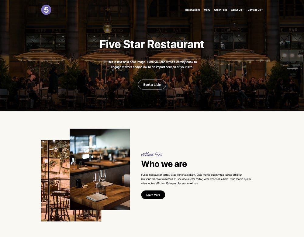
The Appetizer: Captivating Visuals
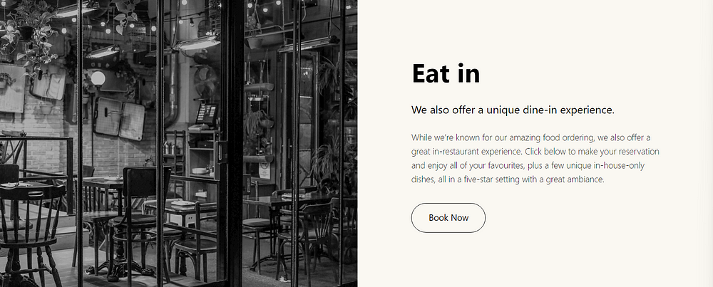
The restaurant website homepage should tantalize visitors’ taste buds with high-resolution images of signature dishes, ambiance shots, and snapshots of happy patrons. Visual content should reflect the restaurant’s personality and cuisine, creating an immediate connection with visitors.
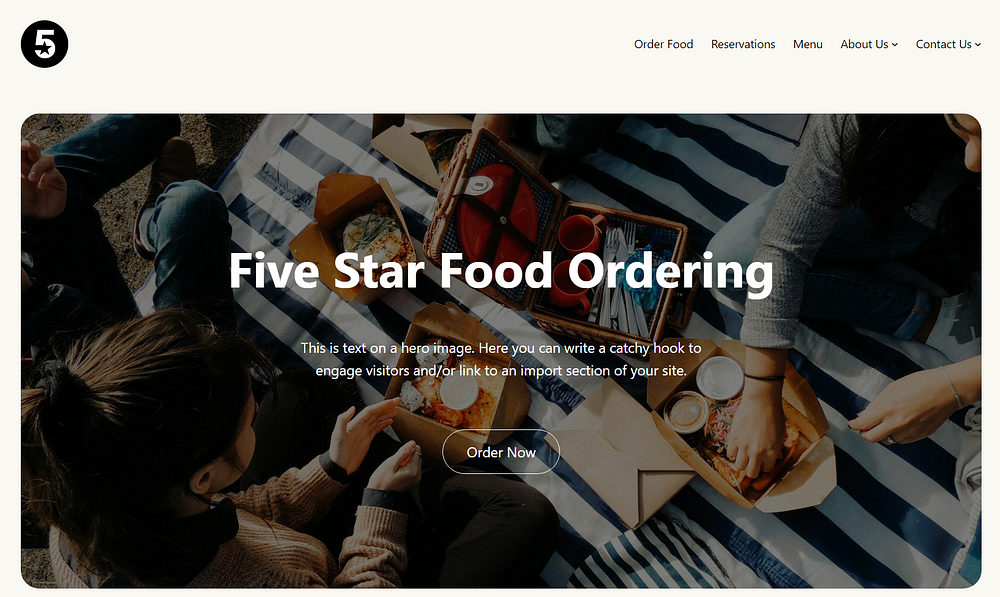
The Main Course: Clear Navigation
Just like a well-organized menu, the homepage navigation should be intuitive and easy to digest. Use descriptive labels such as “Menu,” “Reservations,” and “Contact Us” to guide visitors seamlessly through the website. Incorporating a prominent call-to-action button for making reservations or ordering online can enhance user experience.

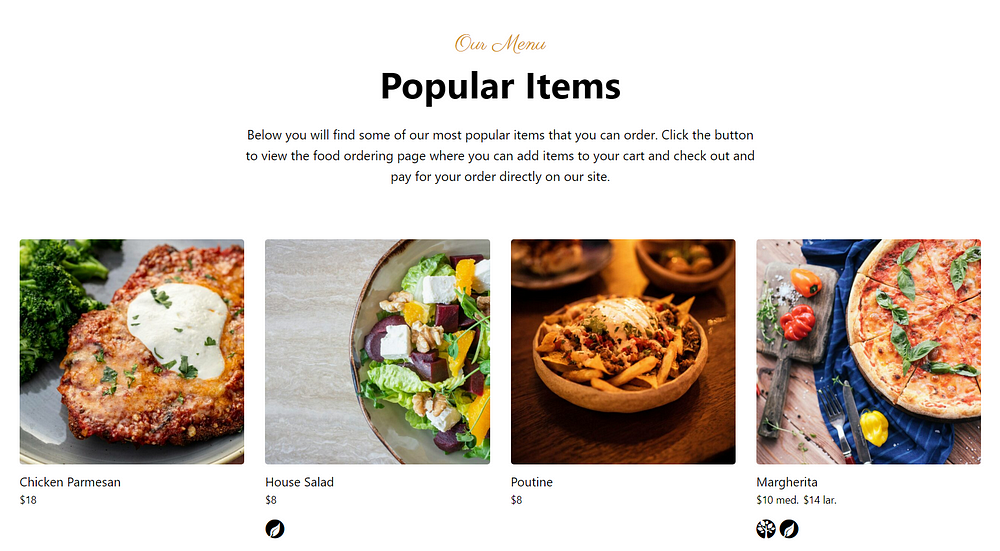
The Special of the Day: Highlighting the Menu
A restaurant’s menu is its pièce de résistance, and the homepage should give it the spotlight it deserves. Incorporate a prominent section dedicated to showcasing the tantalizing array of dishes on offer. Make sure the menu is easily accessible and visually enticing. Consider adding enticing descriptions, like Popular Items or Chef’s Recommendations to tempt visitors’ taste buds further.
The Side Dish: Personalized Touches
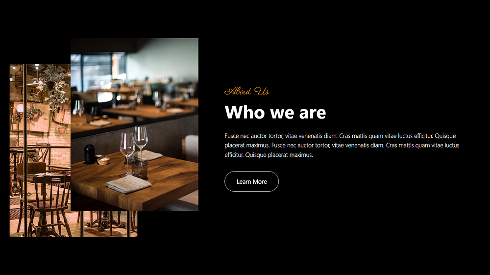
Just as a chef adds their unique flair to each dish, infuse the homepage with personalized touches that reflect the restaurant’s identity and ethos. Incorporate elements such as the restaurant’s story, chef’s profile, or behind-the-scenes glimpses into the culinary journey. Customer testimonials, awards, or press mentions add credibility and enhance the dining experience, fostering a sense of trust and connection with potential diners.
The Dessert: Call to Action
Every great meal concludes with a satisfying dessert, and likewise, the restaurant website homepage should prompt visitors to take action. Whether it’s making a reservation, exploring the full menu, or signing up for exclusive offers, strategically place compelling calls to action (CTAs) throughout the homepage. Use enticing language and visually appealing buttons to encourage engagement and conversion, ensuring that visitors leave with a sweet taste lingering on their lips.
Bonus
Elevate your restaurant’s online presence effortlessly with our Restaurant Website Design Pro plan, priced at just $67/month. Our all-in-one solution requires no technical knowledge or setup on your part, ensuring a quick turnaround and affordability. Enjoy exclusive benefits including an online booking form, custom homepage, social integration, and more. Stand out in the digital landscape and attract more diners with ease.
Final Thoughts
By incorporating these essential ingredients, restaurateurs can craft a restaurant website homepage that captivates visitors, drives conversions, and sets the stage for a memorable dining experience. Remember, the homepage is not just a digital storefront; it’s an invitation to savor the flavors and ambiance of the restaurant, enticing visitors to become loyal patrons.
So, whether you’re a fine dining establishment, a cozy cafe, or a trendy bistro, investing in a stellar restaurant website homepage is essential for whetting the appetites of online visitors and ensuring a full house at your tables.
If you found this article valuable, be sure to like and share it with your fellow restaurant owners and managers.

