Five Star Tips: Optimizing Your Online Menu Page to Get Your Restaurant’s Brand Across
The most popular WordPress restaurant menu plugin available for free, Five Star Restaurant Menu enables restaurants to quickly build a beautifully designed and professional-looking menu page on their website. Our plugin also allows restaurants to allow online ordering for pickup/ delivery right on their website, without having to share a percentage of fees and commissions for third-party delivery services. In this blog post, our team at Five Star Plugin is excited to provide restaurant owners and operators with some tips and tricks to optimize your Five Star menu page, to help you get the most out of your menu.
Learn More About Our Plugins From Our Youtube Channel
- Use original, high-quality visual assets for your menu page
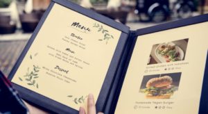
Visual assets play an important role in telling your restaurant brand’s story and presenting your guests with a positive first impression. Using original assets with uniform designs help to improve visual appeal while giving your menu page a customized and professional look (1). It is crucial to ensure that your visual assets match with the actual look of your menu items, as they represent the offerings of your restaurant.
On the other hand, always ensure that you are using the highest-quality assets available when putting together your menu page. High-quality photos are better displayed on all sorts of browsers and devices, boosting your brand’s professionalism and your customer’s confidence as they help customers to make better choices from your menu offerings with their own eyes.
2. Ensure that your menu descriptions are clear, concise, and catchy
While visual elements help to establish judgements on the look of the menu items, menu descriptions are the key to ignite a diner’s senses and drive their expectations (2). However, your customers often don’t spend much time skimming through your menu: According to GrubHub, each diner spends around 109 seconds looking through a menu on average. Because of this, menu descriptions should be kept short and concise, containing the right amount of information to help customers make better decisions. Remember, when it comes to writing menu descriptions, “too much text frustrates your patrons.” (3)
Lastly, pay extra attention to the language and vocabulary used in your menu description: they need to cater to the diner segments you are currently targeting. Using the right form of writing, language, and vocabulary will help you speak better to your guests and bring your restaurant’s brand closer to your audience of choice.

3. Section your menu page based on dish types and menu types
One great thing done by many restaurants is to classify their menu items based on the dish types they are offering to serve, such as Appies, Mains, Desserts, etc. This helps customers to save time when skimming through the menu, by selecting menu items based on the type of dish they are looking to get served.
However, many restaurants also offer specialty menus, for example, special menus for special occasions, healthy menus, etc. In this case, it is a good idea to dedicate whole separate sections on your menu pages for these particular items. This will help guests to avoid confusion while allowing food-savvy diners to discover exclusive picks to surprise themselves on their visit to your restaurant.
Above are the three essential tips that our Five Star Plugins team are happy to offer to restaurant owners and operators. We hope that they will enable restaurants to craft beautifully designed menu pages that create hunger, grow your customer base, and help to drive your sales. Have any other tips, tricks and advice that you want to share with us when it comes to creating an online menu page? Leave our team a message, and we will help you spread the word with the ever-growing community of restaurant owners and operators!


