Create a complex restaurant menu layout with Food and Drink Menu
This tutorial is out of date. If you are using WordPress 5.0 or above, I recommend you use the built-in block editor to build complex menu layouts. Learn more
My Food and Drink Menu plugin for WordPress is a great way to get a simple restaurant menu on your site. I’ve designed it for single- and double-column layouts. But this doesn’t cover every menu. Some restaurant menus like to stack elements in unique positions. This tutorial will show you how to get a more complex menu layout by using the plugin’s shortcodes in combination with the Grid Columns plugin by Justin Tadlock.
You’ll need to have the Grid Columns and Food and Drink Menu plugins installed to follow this tutorial.
What are we trying to achieve?
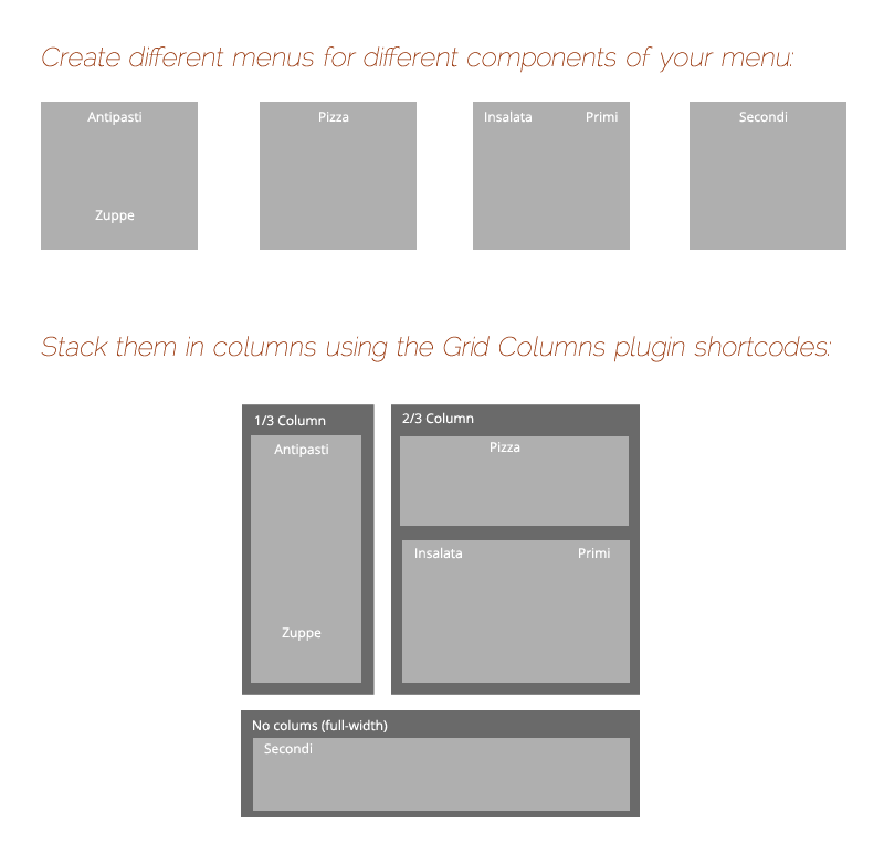
Recently, a customer emailed me with a unique layout he wanted to achieve but wasn’t sure how to achieve it. For this tutorial, I’ll use the layout he needed for my example. Here’s what we want to achieve.

Food and Drink Menu supports a two-column layout, but both columns are of equal width. It can’t (yet) mix and nest columns within each other, either. So even if you were an expert with CSS, you’d have a difficult time replicating this layout. You could get there by setting up your own custom templates, but this requires a little bit of coding experience. And it wouldn’t work if you had more than one menu layout you needed.
What do we need?
In order to achieve this layout we’ll create multiple menus. Then we’ll use the Grid Columns plugin to position and stack them as we need. We’ll create a regular WordPress Page and use the shortcodes from Grid Columns and Food and Drink Menu.

To pull this off, here’s what you’ll need to create:
1. A single-column menu with the Antipasti and Zuppe sections.
2. A single-column menu with the Pizza section.
3. A double-column menu with the Insalata and Primi sections.
4. A single-column menu with the Secondi sections.
If you’ve never created a menu with my plugin, read the help documentation included with the plugin. You can find it in your WordPress admin area by going to the Plugins list, finding the Food and Drink Menu plugin and clicking the Help link there.
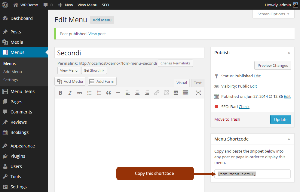
Once you’ve created each of these menus, you’ll need to retrieve their shortcode. You can find the shortcode by going to the edit screen (Menus > Edit Menu). Look for the shortcode box on the right.

Building the whole menu in a WordPress Page
Now we’ll use these shortcodes to print the menus on a regular WordPress Page. Go ahead and create a new page (Pages > Add New). On the page, you’ll use the Grid Columns shortcodes to organize your content. These shortcodes allow you to set up columns and place content within those columns. For example, the following shortcode will create two columns:
[column grid="2" span="1"]My first column[/column]
[column grid="2" span="1"]My second column[/column]
These shortcodes are saying to put the content in a 2-column grid, taking up 1 column. If you’re not sure what’s happening here, go ahead and copy this code into your page then preview it. You’ll notice that the content is stacked horizontally instead of vertically.
Are your columns not appearing? Make sure you’ve activated the Grid Columns plugin!
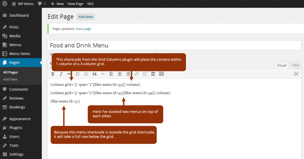
Using this technique, we’ll nest all of our menus in columns to get the effect we want to achieve. Here’s a screenshot showing you how I achieved it for the example menu.

And that’s it!
If you’ve never used shortcodes it can take a while to get used to them. The Grid Columns system is as simple as it can be, but it still might take a little trial and error to get your head around how to use them. Go ahead and experiment a bit. Remember, the Grid Columns plugin can be used for any content, not just your restaurant menu! And it’s built to be responsive, so the columns will collapse on small browsers like mobile phones and tablets.
Want more tips and tricks on how to use my themes and plugins? Follow me on Twitter or Google+.
Developers, take a deeper look at the WordPress Shortcodes API.


